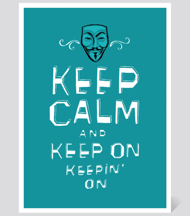
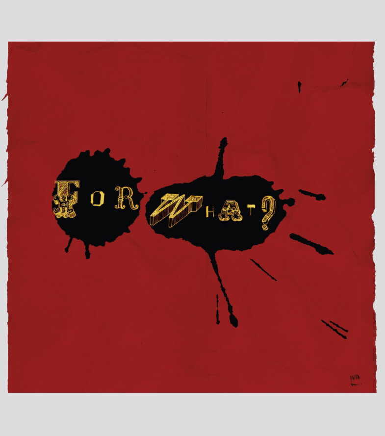
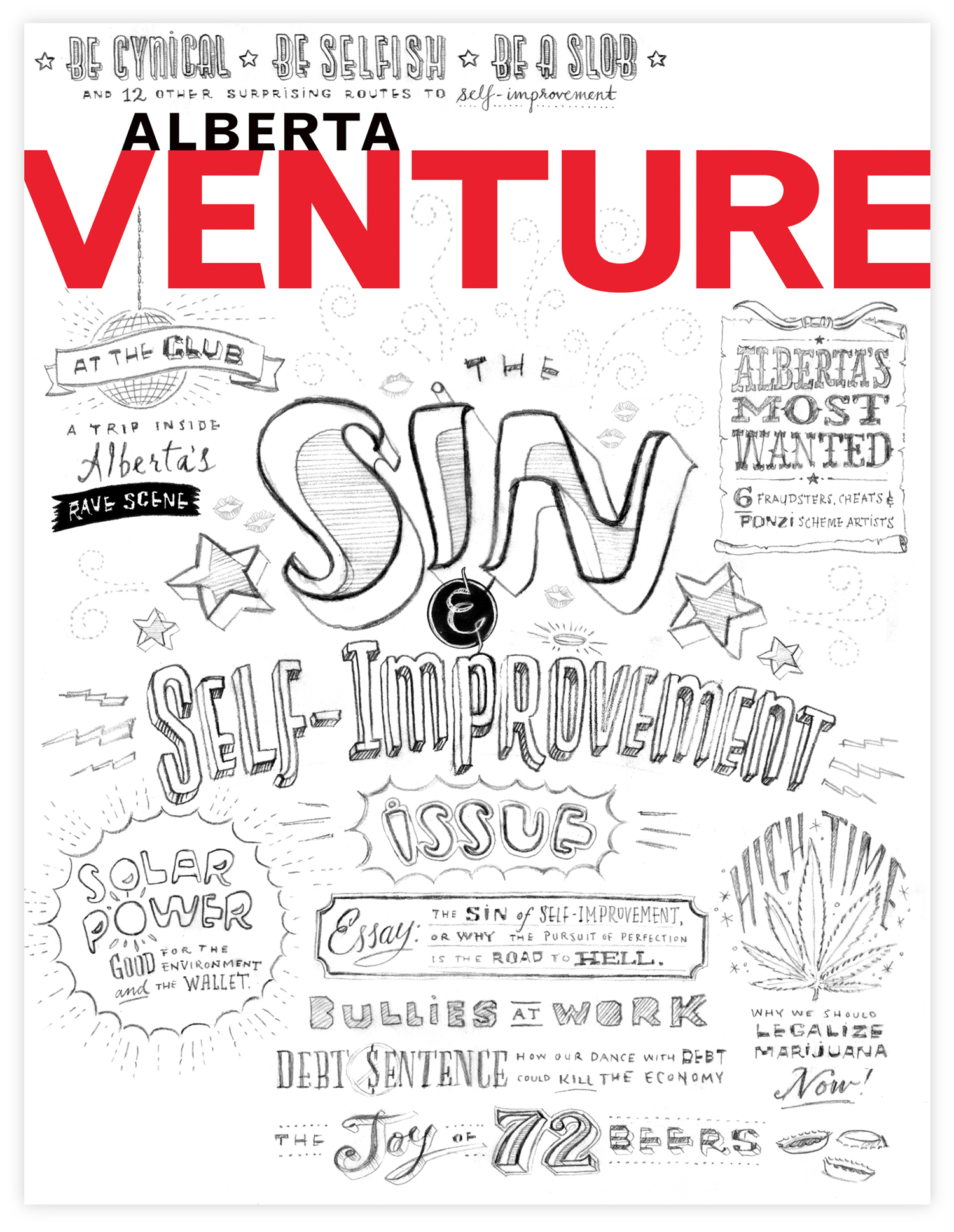
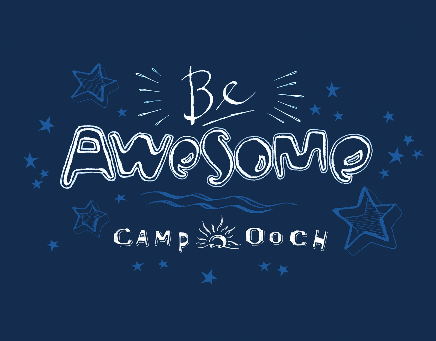
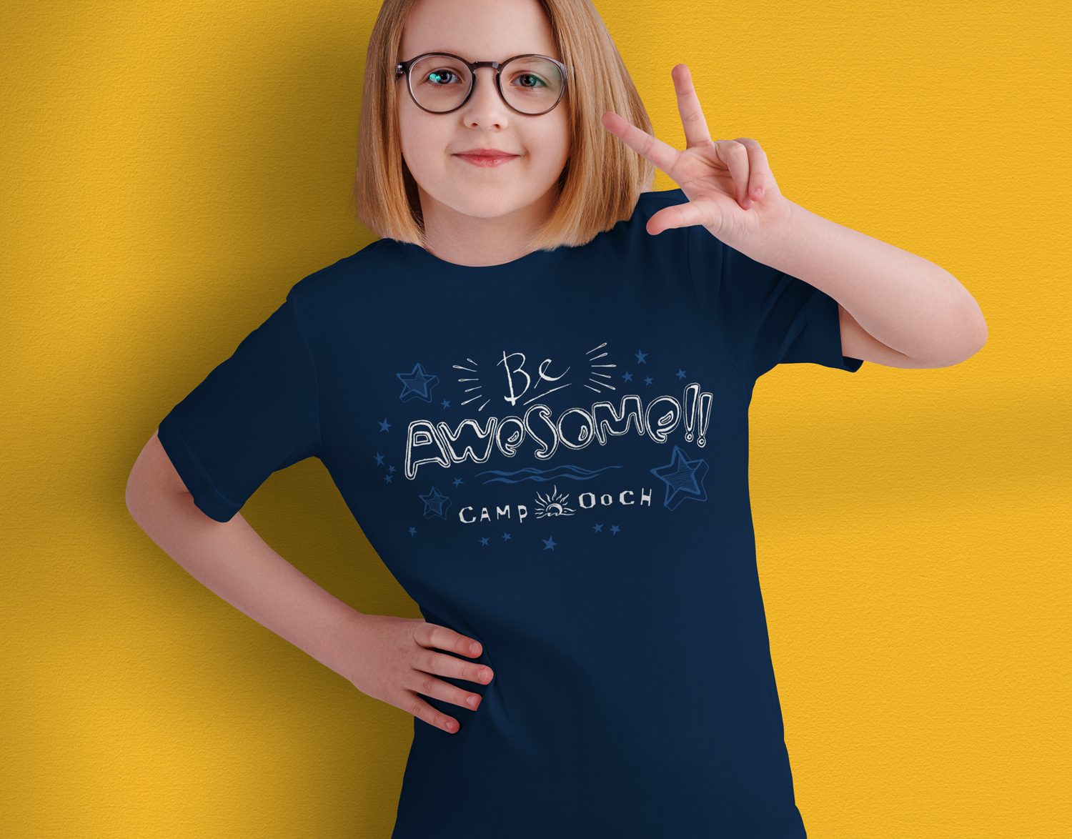
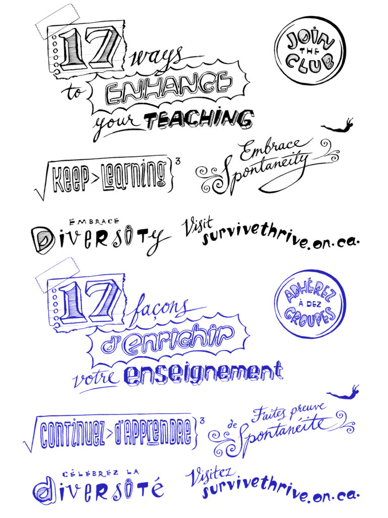
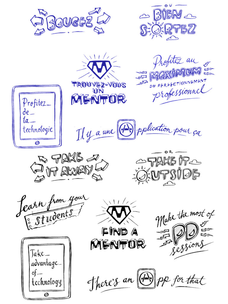
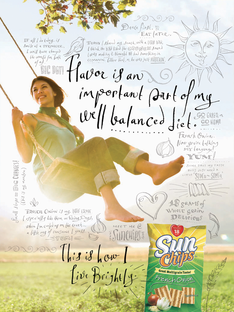
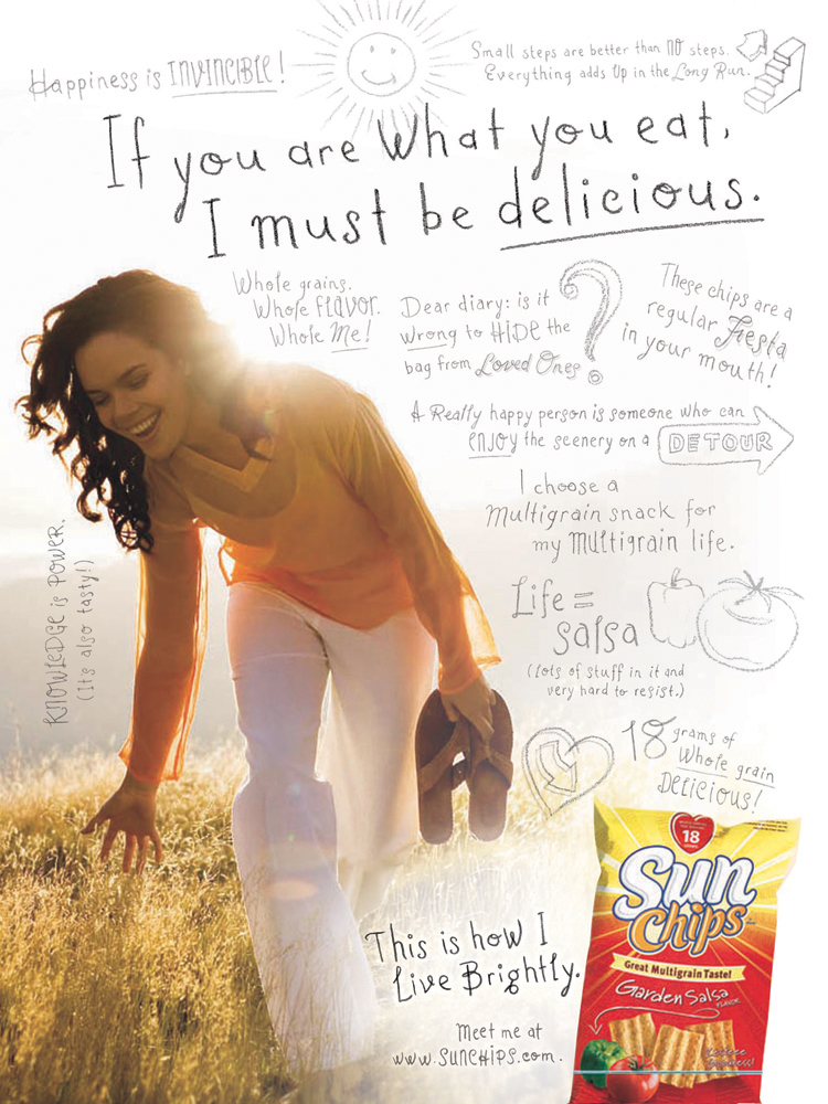
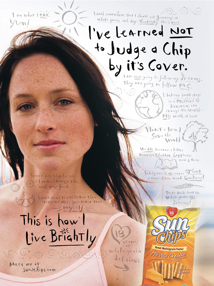
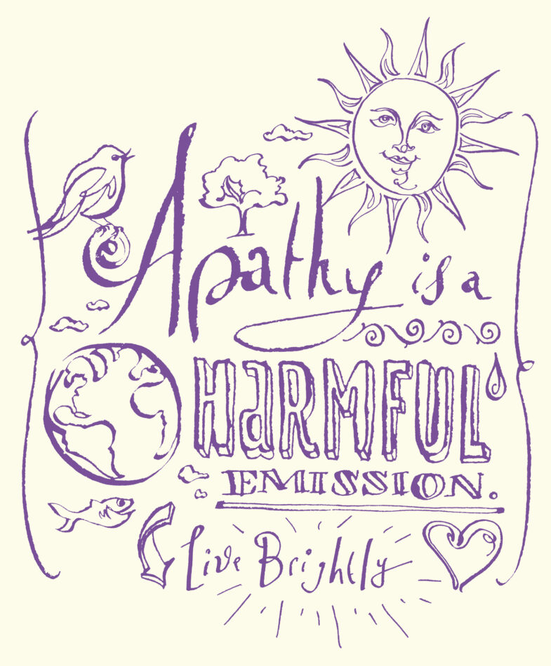
Keep Calm and Keep On Keeping’ On – (2012) my take on the over-saturated, viral meme which originally appeared as a “catchphrase… on a World War II-era British public safety poster.” For What? – An antiwar poster image created during the Iraq War (2003). Alberta Venture Cvr – an initial sketch for a Canadian business magazine cover (2012). Be Awesome – (2011) an unused type solution intended for usage by Camp Ooch, which are “a privately funded, nonprofit oncology camp that supports kids and families” Professionally Speaking Magazine – Editorial typography (in both English + French) for a Canadian magazine for the Ontario College of Teachers (2012). Juice Ads (2011) – Fun, black + white editorial typography created for several print ads mixing type with photography for PRSS.org – “ ‘the Juice’ for public radio broadcasting.” Random Lettered Pattern – personal fun with vintage letters (2009). Sunchips Ads – Fun, editorial typography for three ads and later earth-day celebratory promotional tee-shirts for Frito Lay (2007).
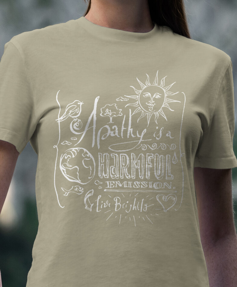
Mockups were created to showcase the various lettering examples as they might appear on different print and merchandise applications.